
Copy of whitekoat
whitekoat
whitekoat is a startup founded in Sacramento where I worked from 2014-2016. I was the sole designer in a team of 11 people, and as such, I had to wear many hats. I did the UX, UI, branding, internal materials, and some content creation for the site itself.
whitekoat started as a medical image library and quizzing platform, but pivoted into a generalized, comprehensive medical library and quizzing platform. Our strategy was to use our proximity and connections to the UC Davis Medical School to establish ourselves as an academic tool for both professors and students.
Design Goals
Because of the extremely varied amount of medical information, and in order to be flexible to any upcoming changes, we wanted the design to be extremely modular. Keeping with the academic, we decided to use cards as our visual representation of data. Cards could be separated into types, based on what kind of information they held, such as text, images, videos, and questions. They then could be made into decks in order for users to organize their cards into study devices.
Our goal was to mimic flashcards which were used by the majority of the medical students we worked with, but with the advantages of a digital platform.
All of the designs I created were purposely extremely simple, as our front end team was one person. With the amount of work and number of changes that would occur throughout the course of a testing cycle, this was the most realistic way of putting forth a useable product.
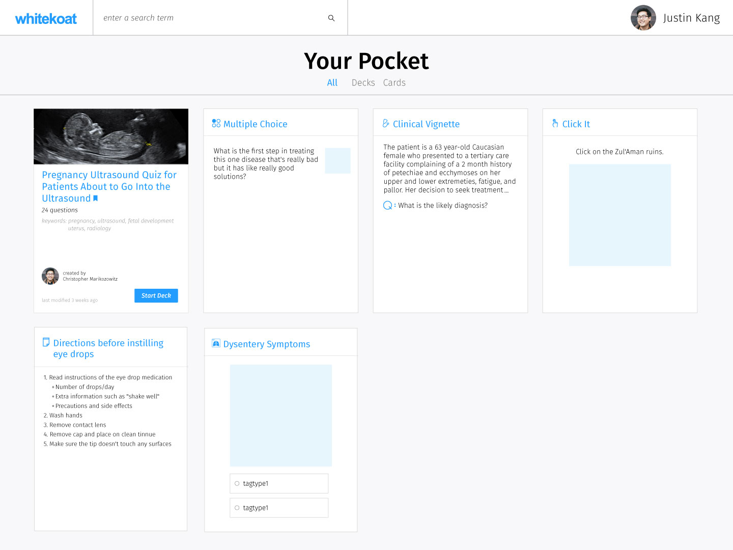
The Pocket
In the whitekoat environment, all the cards a user had saved or created would be saved in their Pocket. From here, users can organize and interact with their cards and decks.
Card Creation
The card creator was the most difficult to design, as the number of modular pieces within the cards would increase with each type of card added to the whitekoat library. Again, all of the pieces within the cards are modular as well, in order to allow users the maximum amount of freedom when creating cards.
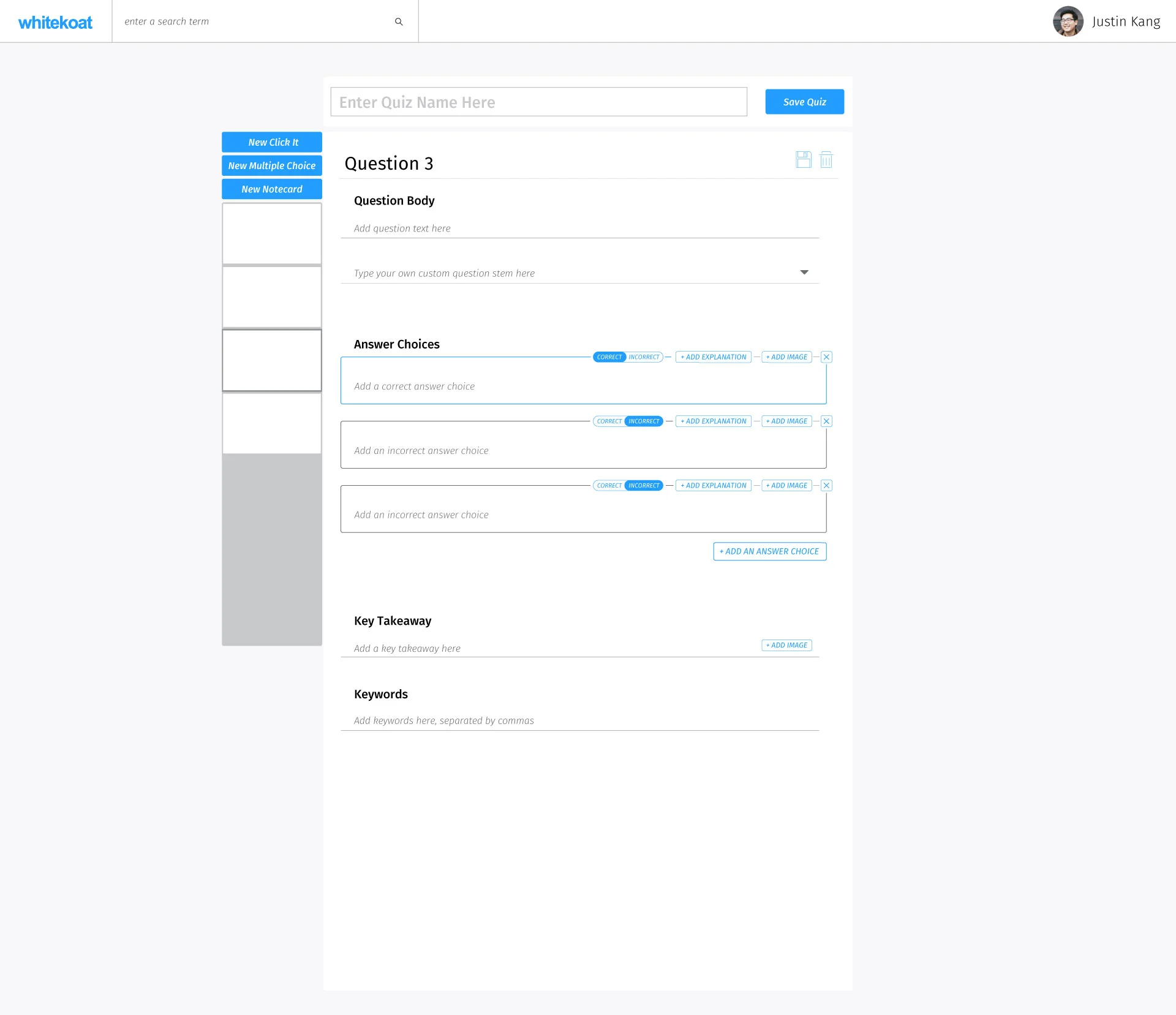
An empty creation form for a Multiple Choice card.
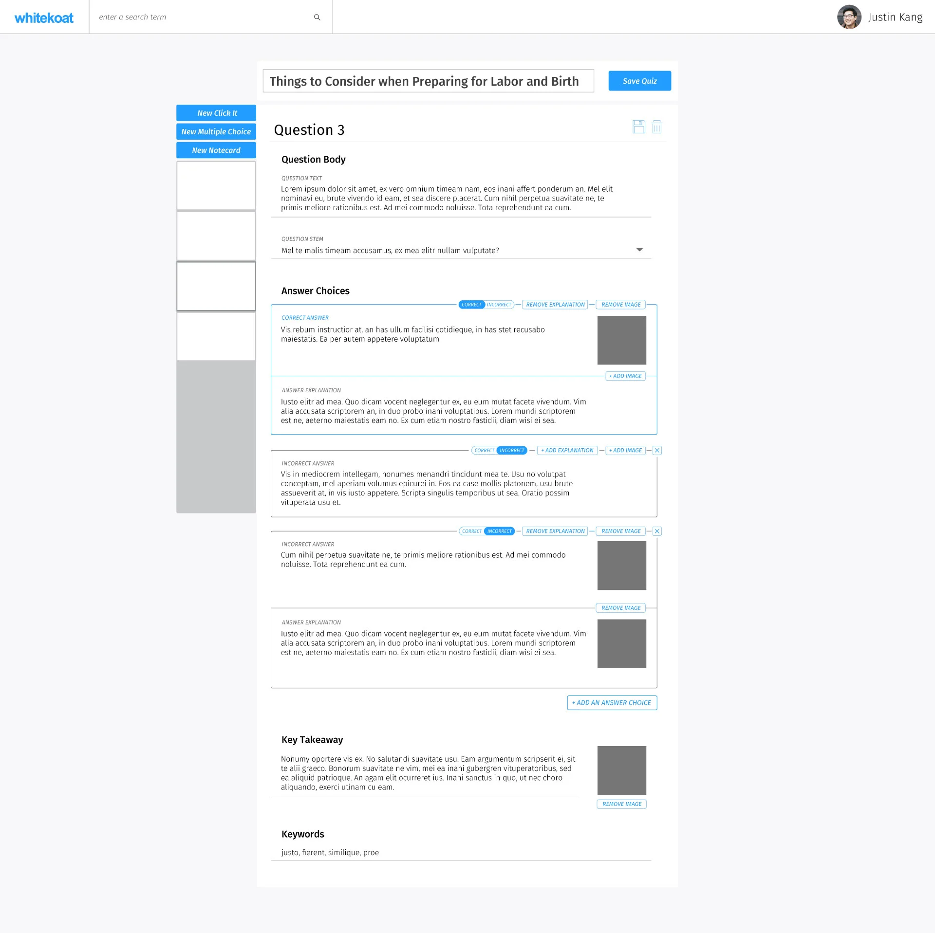
A completed creation form for a Multiple Choice card.
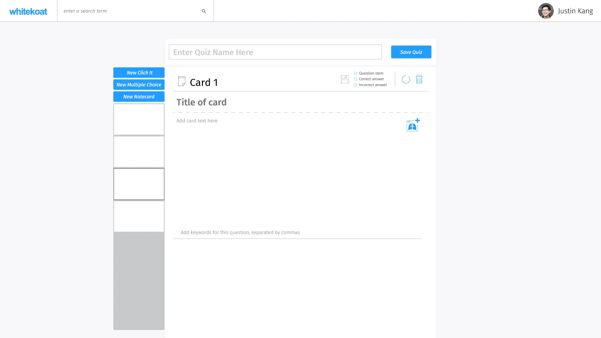
An empty creation form for a text card.
Deck Interactions
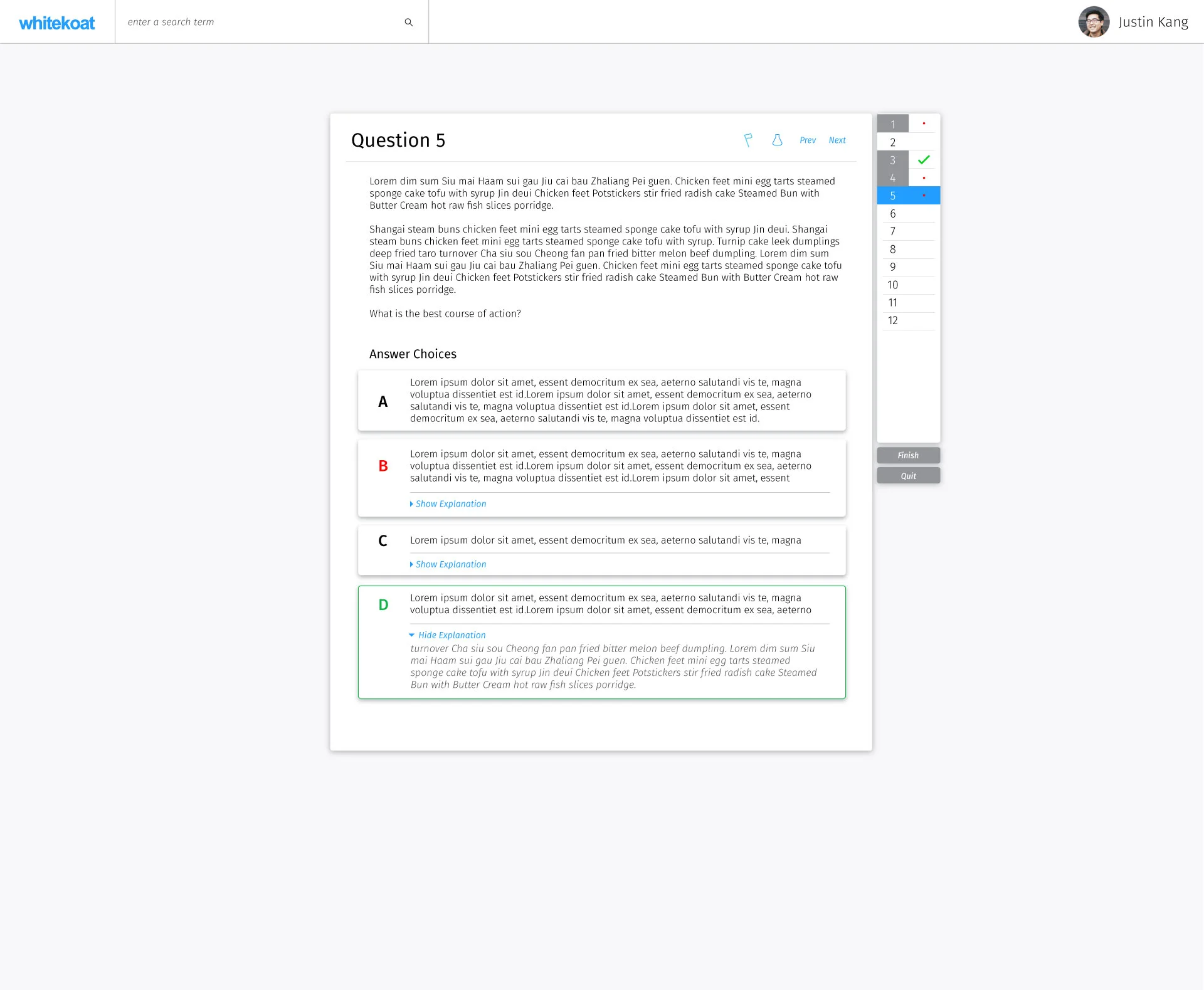
Going through a deck was one of the core experiences a user would go through many times. From multiple rounds of user testing with the med students, we found that the most minimal interface was the one that performed best and gave users the focused environment they needed when going through their decks, whether just to review cards or when doing quiz decks.

Groups and Clinics
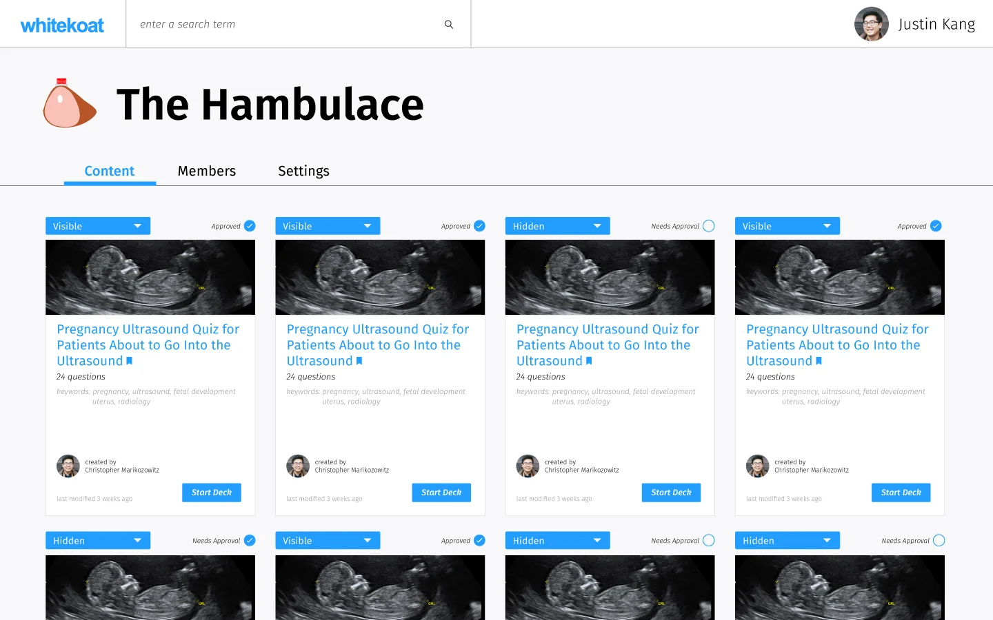
After creating a system in which users can create and share cards with one another, the next step we took was to implement groups. Groups were basically a shared Pocket for any number of people with shared permissions. The early version I worked on was extremely bare bones and was literally a pocket with an administrator page. This however was exactly what the students wanted.
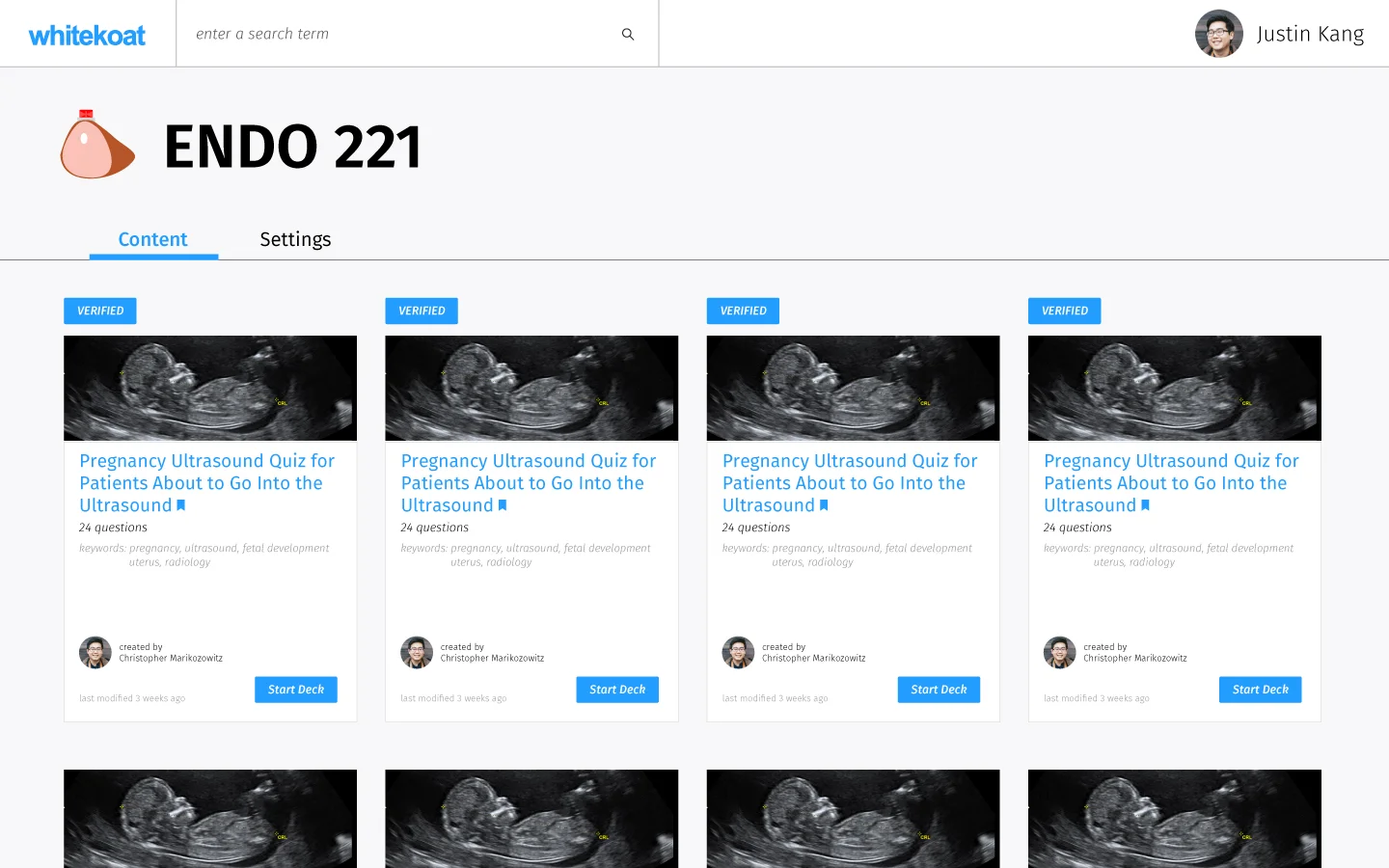
Content shared between members of ENDO 221
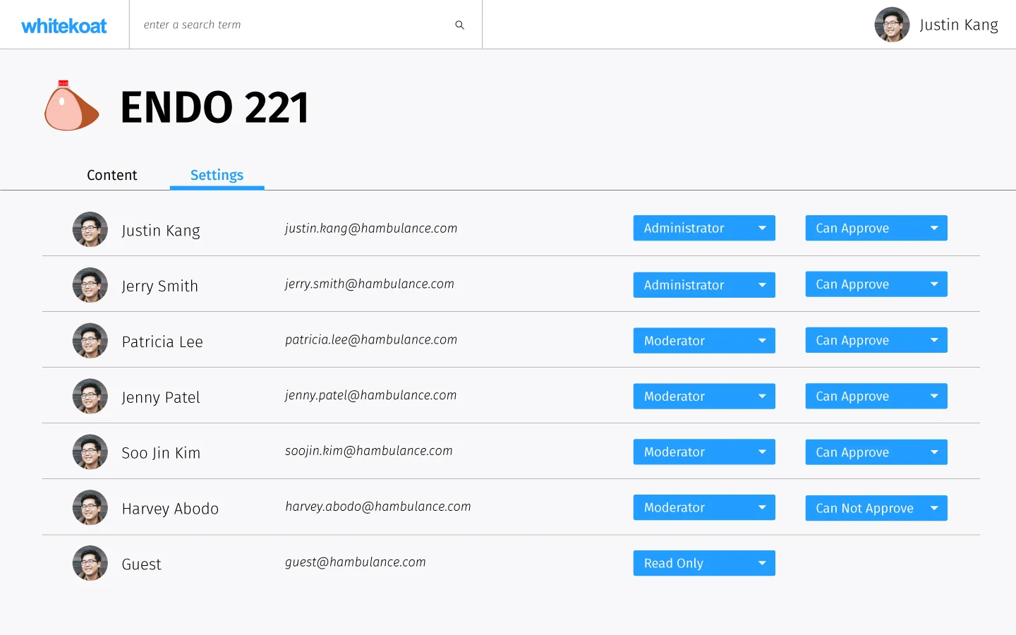
Administrator view for the settings page of the group. Functionality is limited to membership and content submission approval.
These group pages came in line with partnerships with several small clinics who agreed to use our product as a patient engagement/education tool in the waiting room. The clinics however, required more stringent permissions guidelines in order to make sure they had full control of what patients were able to see.
Controls were added for the administrator and member screens of the Contents tab and a new user type was created that was "read only" for patients to use in the waiting room.
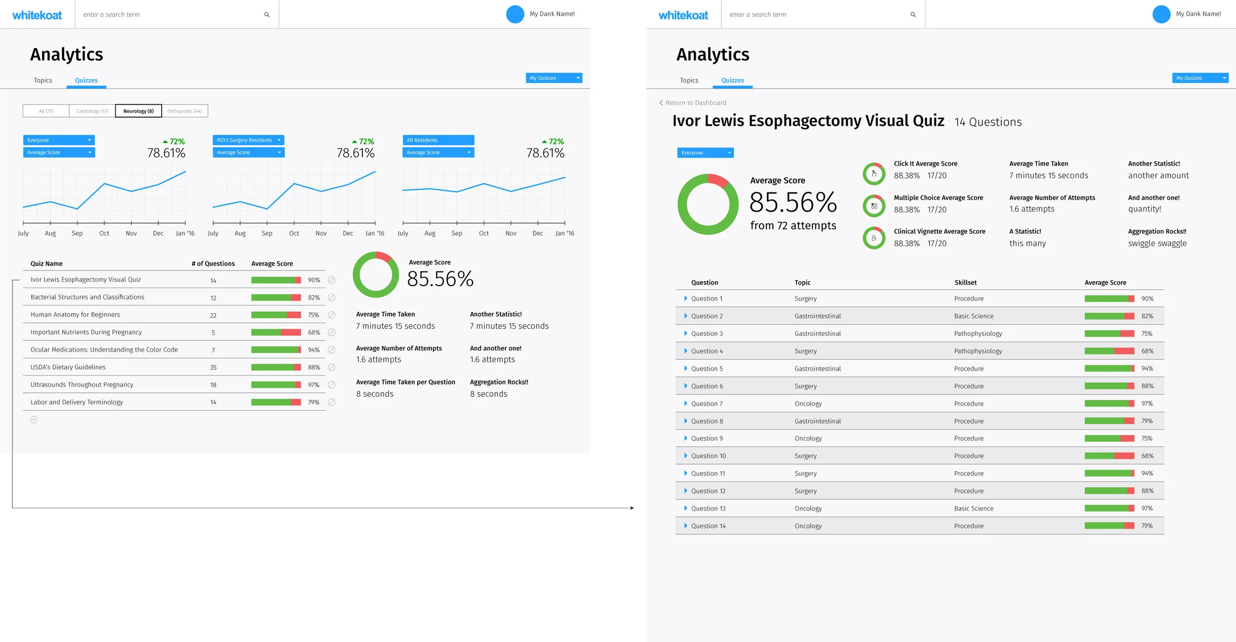
Analytics

Onboarding
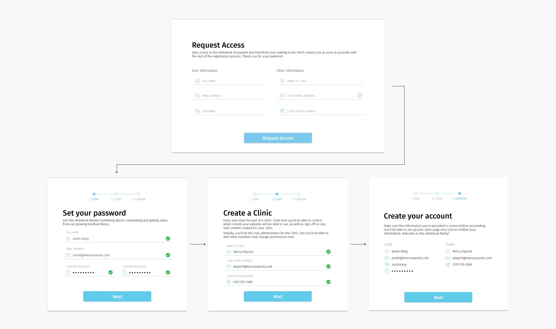
Onboarding process for clinics and practitioners
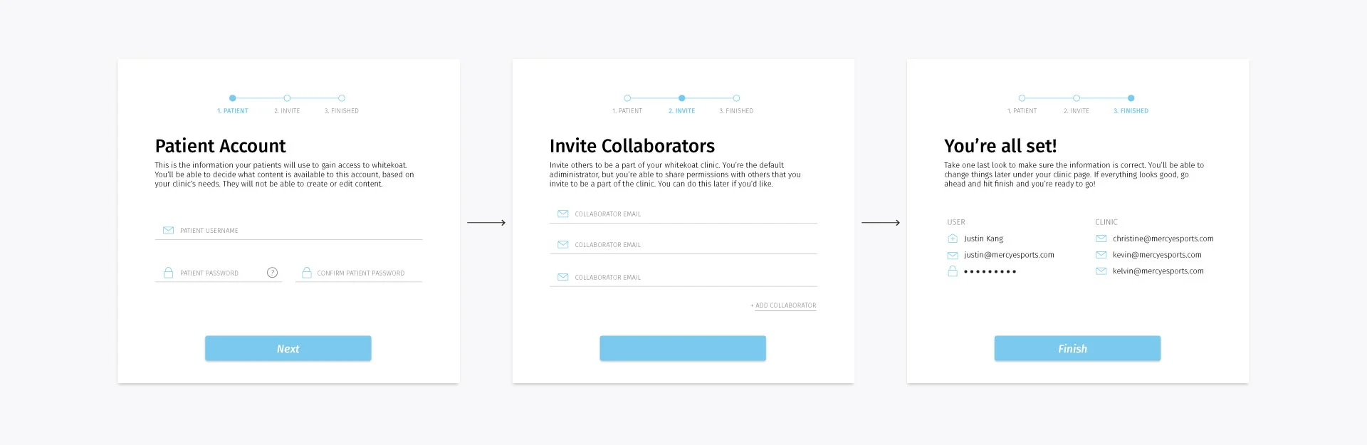
Onboarding process for patients and students